THE EVOLUTION OF THE INSTITUTIONAL LOGO
The visual corporate identity that accompanied the School of Midwifery has been given up as lost in time. When the school assumed the name of Medical Center Lucena Educational Institution (MCLEI), it was bannered by a logo (next page, top left) that more or less represented the trend among school logos that is manifest to this day: that “school medal” border, the book and torch to rub in the point that it is a school, and a caduceus to signify that it is a paramedical educational institution. It was later “digitized” for improved presentation (next page, top right).
Aside from being a logo with a caduceus, nothing else really set it apart from other school logos. As the school changed its name to Calayan Educational Foundation, Inc., the management decided that it wanted a logo that will distinguish it from the plethora of medal-like school logos in the country.
The school commissioned the task to one student by the name of Niño Daep, and out came the logo that we know today (middle left). Instead of a medal border is a slanted square with the school’s initials inside. The letter “I” of CEFI was represented by a caduceus, and the red leaves (yes, they are leaves) represented his version of “a new beginning.”
The result was indeed a logo that could be instantly recognized among school logos in the province.
Green has always been the school’s color, but it was never sure exactly which green. It did not help that several schools in Lucena City and Quezon Province are also green, and like CEFI, their green kept changing from time to time. It was not until 2010 that CEFI settled for the dark green and yellow we know today (previous page, middle right). The red leaves were changed to a golden flame as homage to the institutional hymn.
As part of the school’s 50th anniversary, CEFI unveiled its most recent version of Niño Daep’s logo (previous page, bottom). The caduceus has been replaced with the straightforward “I” in cognizance of the fact that CEFI is no longer just a paramedical institution, but has in fact grown to also offer non-health related programs. The year of founding was also included in the logo. The school name has been excluded because the logo is always used along with its name, thus avoiding redundancy.
Over the decades, there have been criticisms about how the CEFI logo focused less on essence and symbolisms, and more on identifiability, giving off that allegedly “commercialized” feel that describes contemporary school logos sported by for-profit college networks.
To this, our response is that the purpose of a logo has always been to identify and set apart the entity that it represents. Those who are not part of the organization care nothing of the values or essence we imagine are represented by the symbols and objects in a logo.
It is the institution that imparts the image to the logo that represents it, and not the other way around. In the words of fictional character Alfred Pennyworth, “It is not who you think you are, but what you do that defines you.”
And so, if the CEFI logo does indeed exude excellence, uniqueness, and ambition, it is because that is what CEFI is.

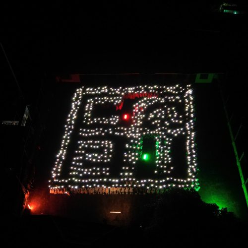
More than 700 students assembled at the Ecopark to form the institutional logo as part of the upcoming 50th founding anniversary. For a few brief seconds, the dark of night was pierced by little dots of light from more than 700 mobile phones waving above their heads. This feat took an entire day to put together, and was in itself a testament to CEFI’s sense of unity. Teachers and administrators were on the verge of tears tears as the 700 suddenly chanted the Ode to Victory, which was not part of the plan.


